|
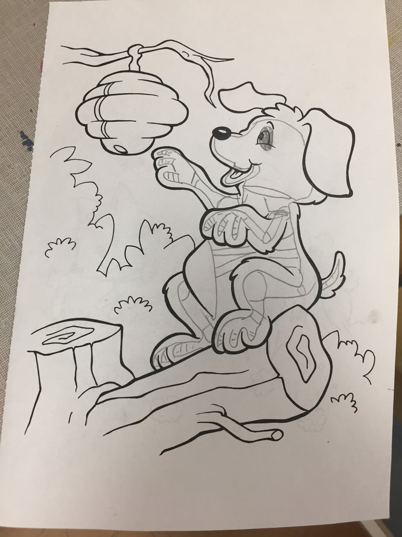
For my newanimal, I created the Horned Dogle. It eats small animals like mice, but enjoys snacks like dog treats. I came up with this idea by mashing together 2 of my favorite animals. I added the horns in after the original animal looked too bare. During this project I ran into the problem of having to find a good quality picture of the horns. First I had to find the right type of horn, then I had to find the right type of viewpoint so that I could merge it onto the dog head. If I could change anything about this project, it would be to resize the dog head, because it looks a little out of proportion. 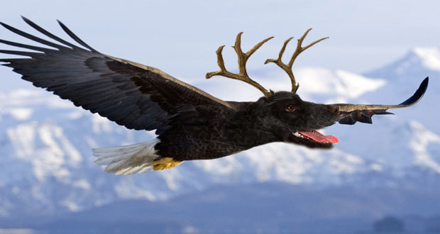 
0 Comments
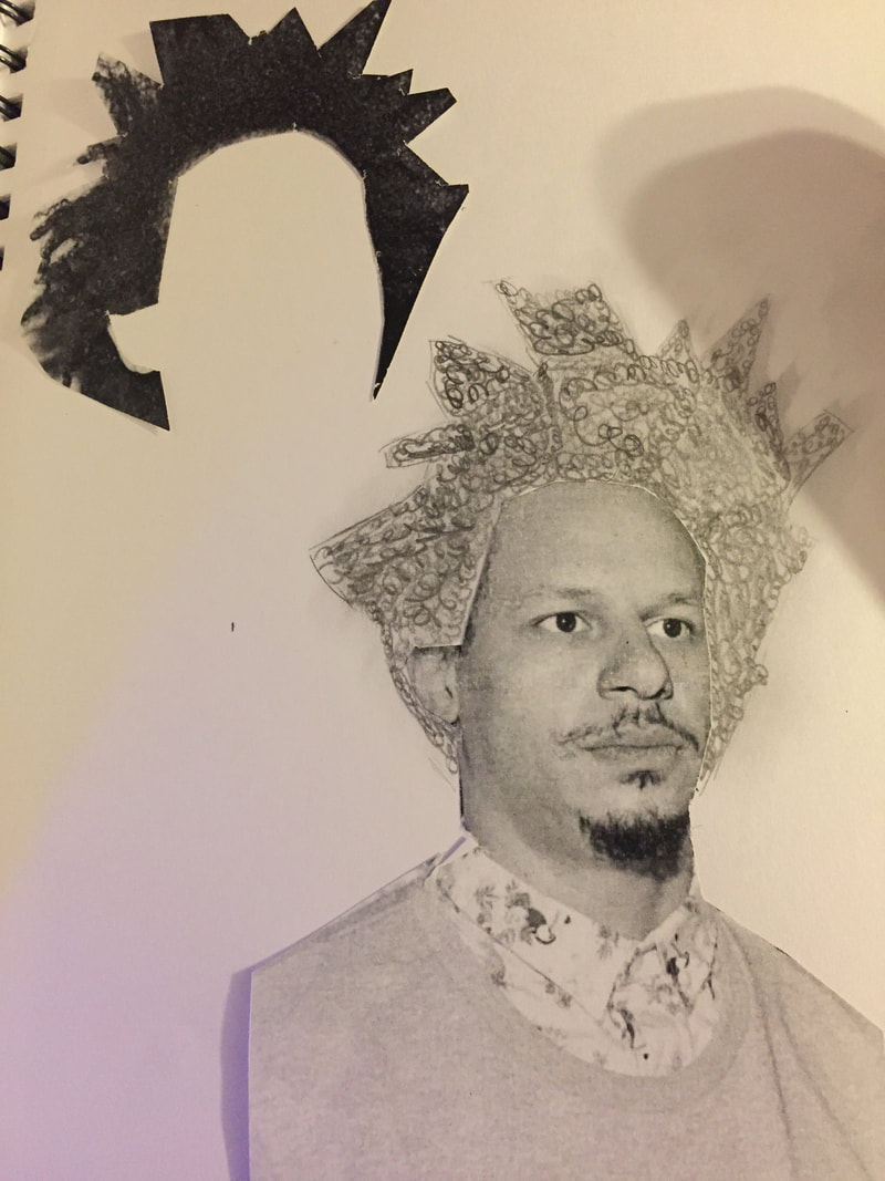
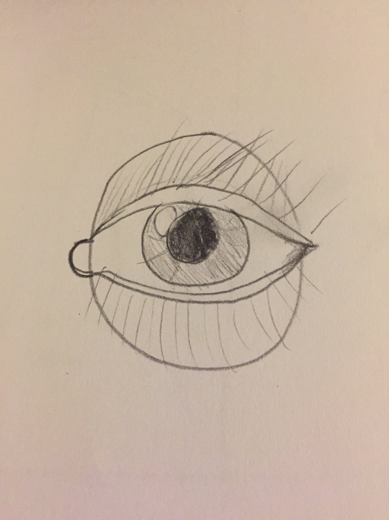
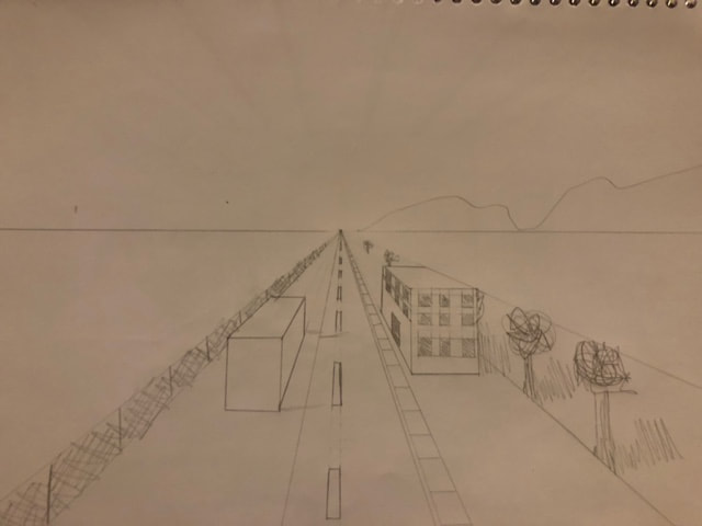
Art Criticism is the evaluation of artwork by: -Describing what is in the artwork. This includes colors, styles, and techniques. -Analyzing the artwork. This includes items such as value, mediums, colors, and texture. -Interpreting the artwork. Ask yourself "What is the mood of this work?", or "What do I feel when viewing this artwork?" -Judging the artwork. Consider if this artwork is successful in conveying it's message.  Using the art criticism process, I will critique my above piece. This is a watercolor medium with a single-point perspective. I started out on this project with a picture and a rough sketch on regular drawing paper, then transferred the illustration to watercolor paper for coloring. Painting in general is not my strong suit, and the beginning of this piece began shakily. Over time, I learned how to make watercolor paint work to my advantage, and how I could use mixtures and different values and shades to achieve different colors. This project did not take me long, only about 3 days. I believe that the picture can be easily described, as I made sure not to make the piece too crammed with details. The colors appear somewhat natural, with the only exception being the gravel around the railway ties in my opinion. If one were to analyze this piece, I feel that they might find slight faults with the colors being too light or dark in a few smaller areas. One might also find fault in some of the colors in the trees mixing, especially near the trunks and limbs. The mood or feeling of this piece reminds me of just a bright, sunny day, and perhaps towards the opening of springtime. To me, this picture represents a feeling of cheeriness and hope for whats down the line, as I took this picture when I got my driver's permit. Finally, I feel that this piece comes across as successful, with the goal of recreating the scene fairly conquered. Below is the original image for anyone who would like to compare. (The artwork is slightly cropped.) 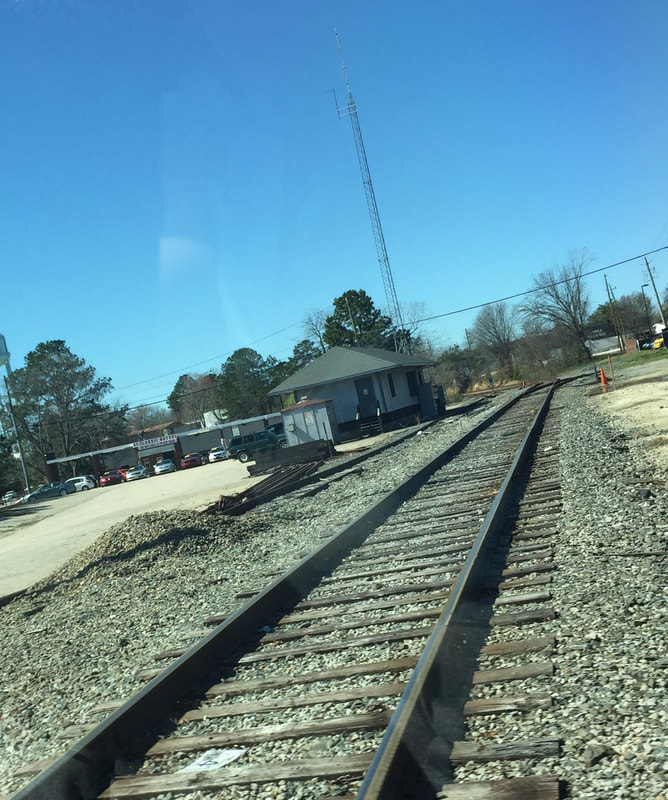 3 Questions: (5) What is artistic style?- Artistic style is an artist's preferred style or technique when it comes to a specific medium. Every artist has their own style, even if it is just slightly different from other styles. For instance, I have a specific style of making tree leafs, as shown below. 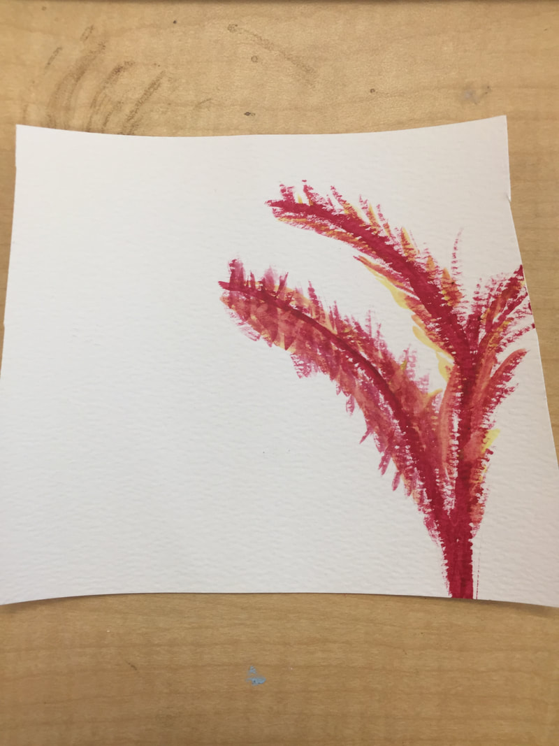 (7) What is the point of this class? What did you get out of it?-I believe that the point of this class is to not only teach students how to better their artistic abilities, but to encourage them to explore further into the art world. Art 1 is a base class that opens up the possibility of classes like Art 2 or AP Art. I got many things out of this class, but the most prominent would have to be how to look for inspiration. Before this class, I would draw things that I mostly made-up, but after doing projects on real-life objects, like the piece below, I realized that there were many more places to find inspiration than just one's imagination. 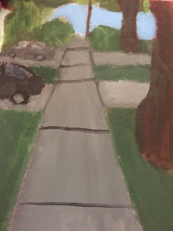 (8) What was the warm up or sketchbook assignment that you learned the most from?- The warm-up that I learned the most from was probably a combination of the facial drawings. I was never good at drawing faces, but after these warm-ups I slowly learned how to draw eyes, noses, mouths, and ears, along with the facial proportions. This helped me when making the Skittles portrait, as I had to rough sketch the basic facial details before gluing the Skittles.   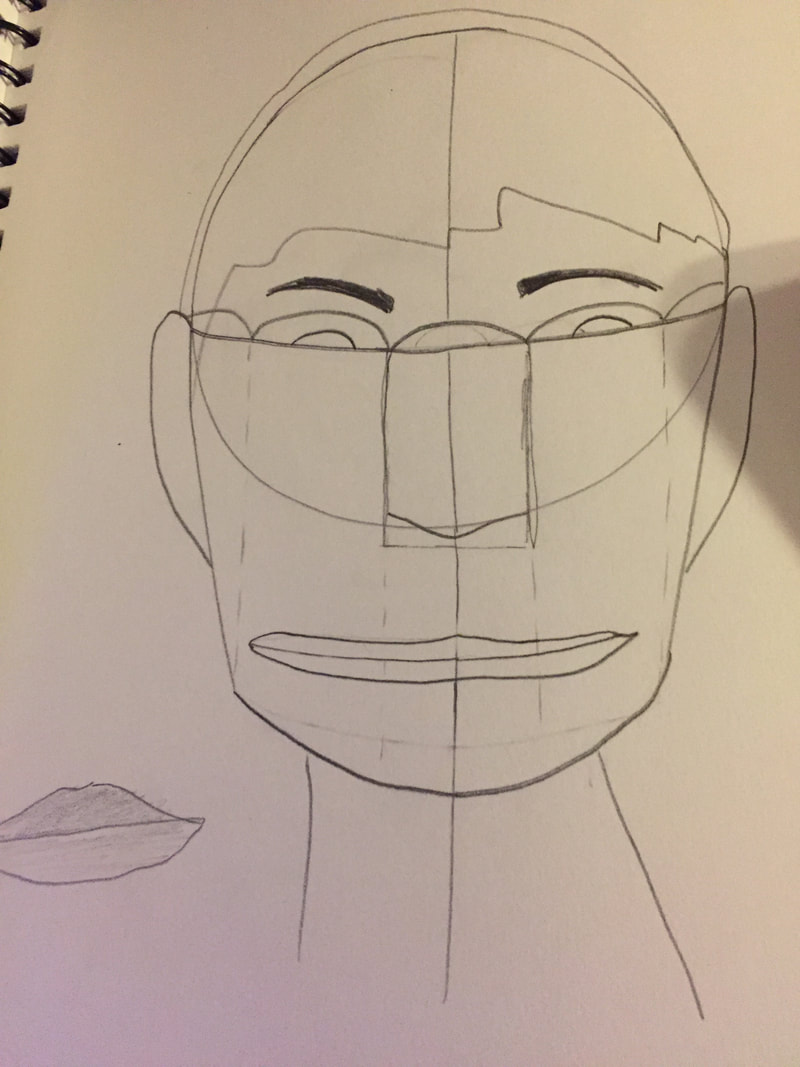   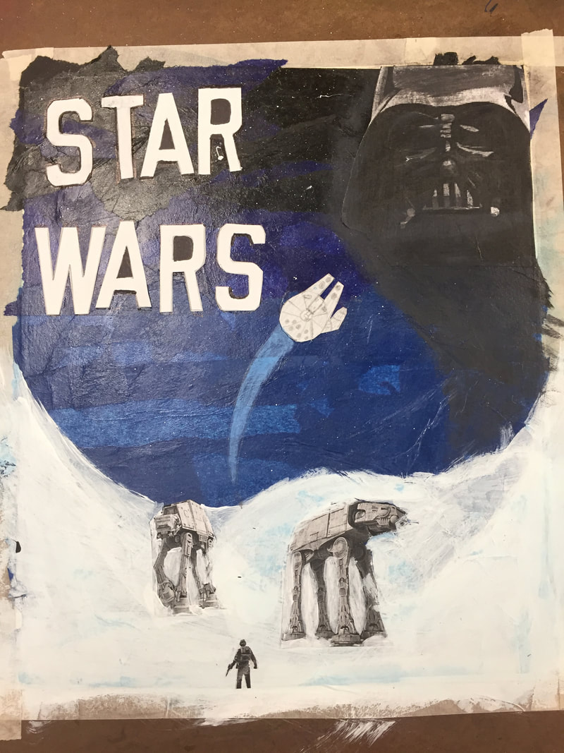 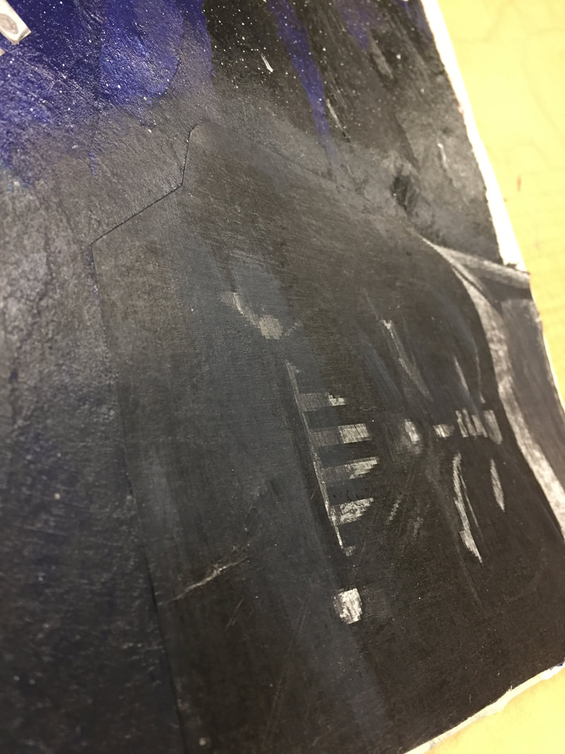 For the beginning of the project, I layed a layer of tissue paper, then covered it with a layer of paste. Next, I added the "STAR WARS" letters in the top left corner. I then added the white paint on the bottom representing the snow. I cut out the pictures and glued them onto the white painting. I then added the Vader helmet in the top right corner and the paint around it. Finally, I drew the Millenium Falcon and painted the blue "streak" behind it. My word was to make something that you enjoyed, so I decided to make a Star Wars collage, since I enjoy the movies. I portrayed this in a variety of mediums ranging from paint to pencil to cutouts.
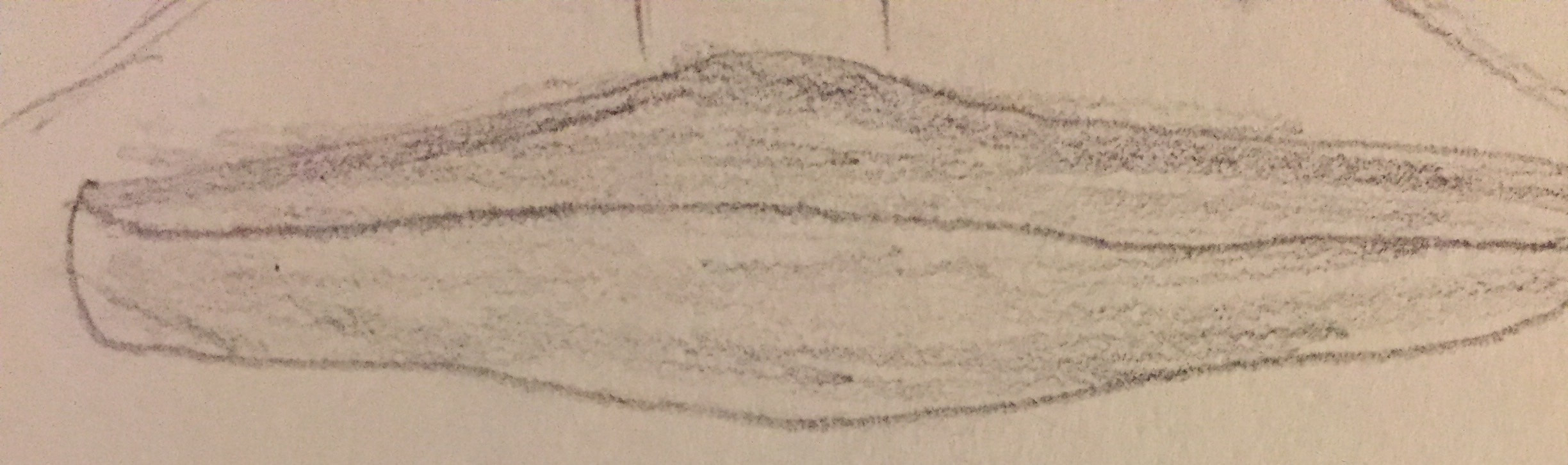
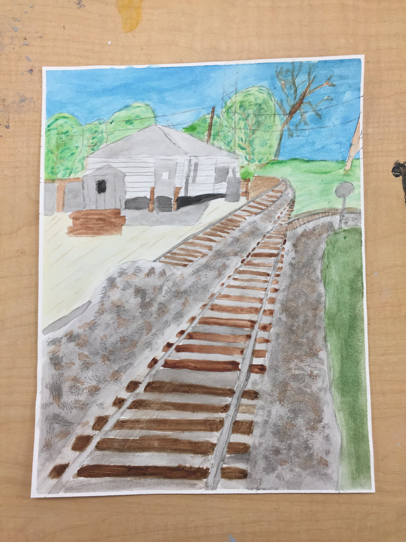 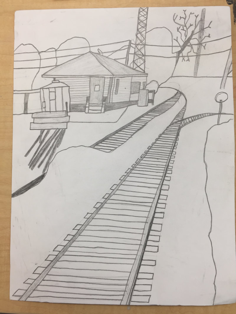 I used a 1-point perspective because it was the perspective that was in the original photograph. I took this photo in Fuquay-Varina at a railway crossing. I thought it was a cool photo due to the vanishing point of the rails. The most difficult part of this project was probably the individual ties between the rails, because it was harder to be neater with the smaller ties in the back.  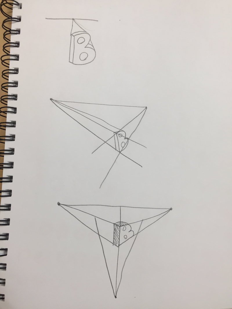 These 2 warm-ups were the most helpful. The leaves warm-up helped me be able to make more realistic looking trees, while the letters warm-up helped me understand how a perspective point gave a more detailed look to an object.
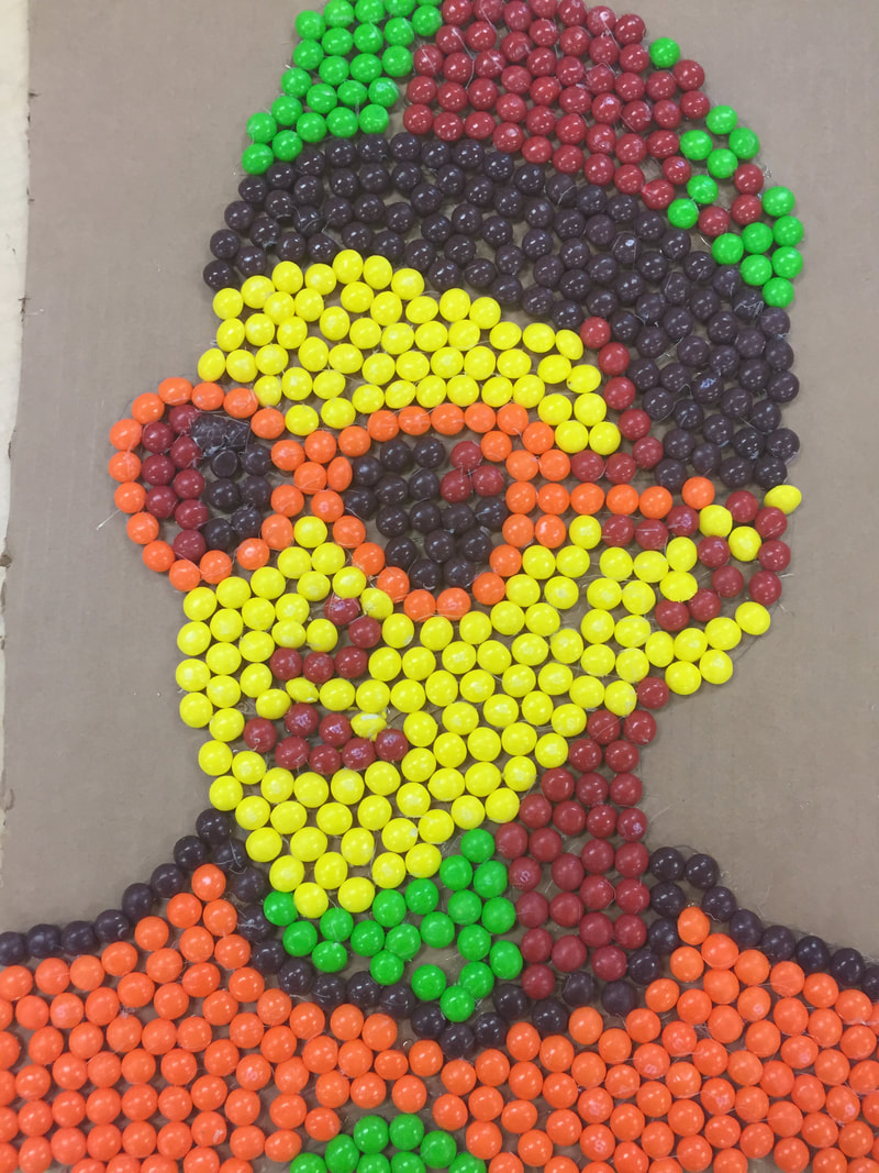 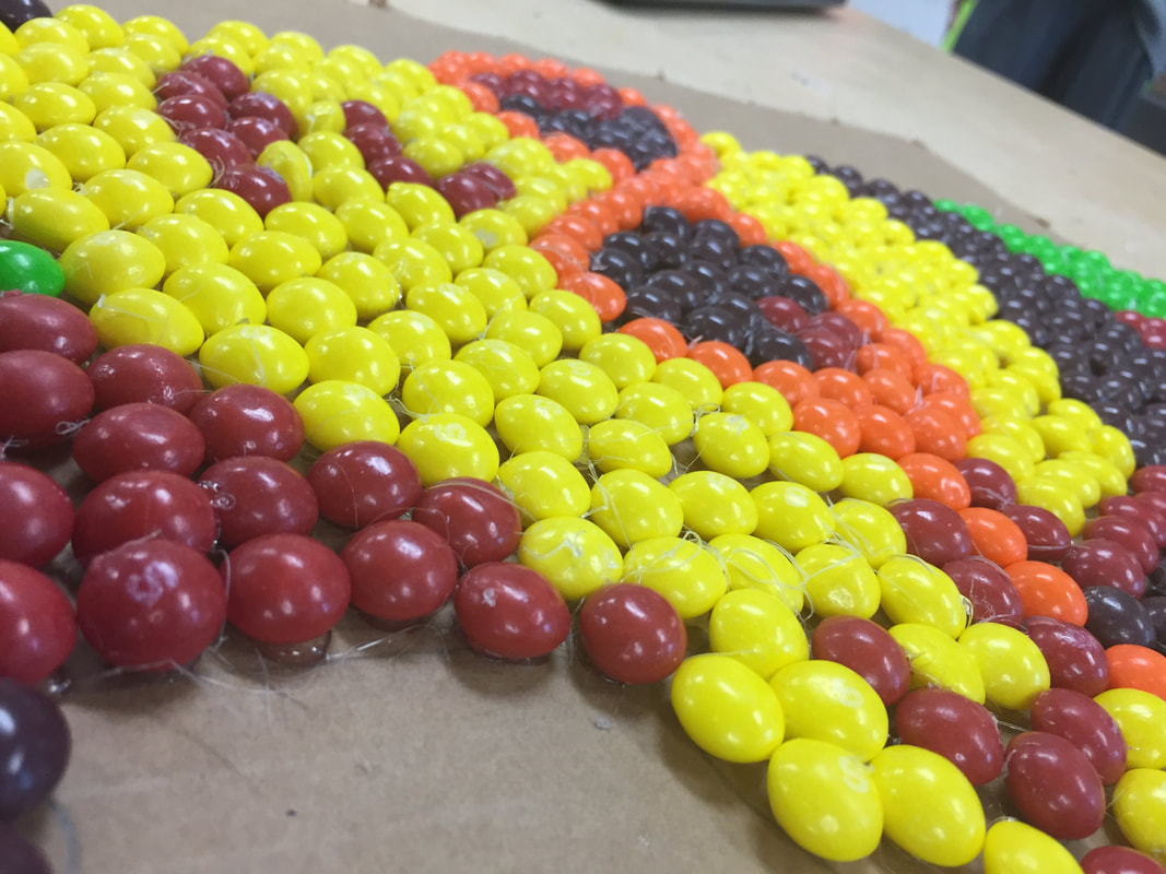 I did a portrait of my friend Radek. I chose this person because I knew that they really enjoy art and loved doing this project. I made the portrait out of Skittles because they are one of his favorite foods. 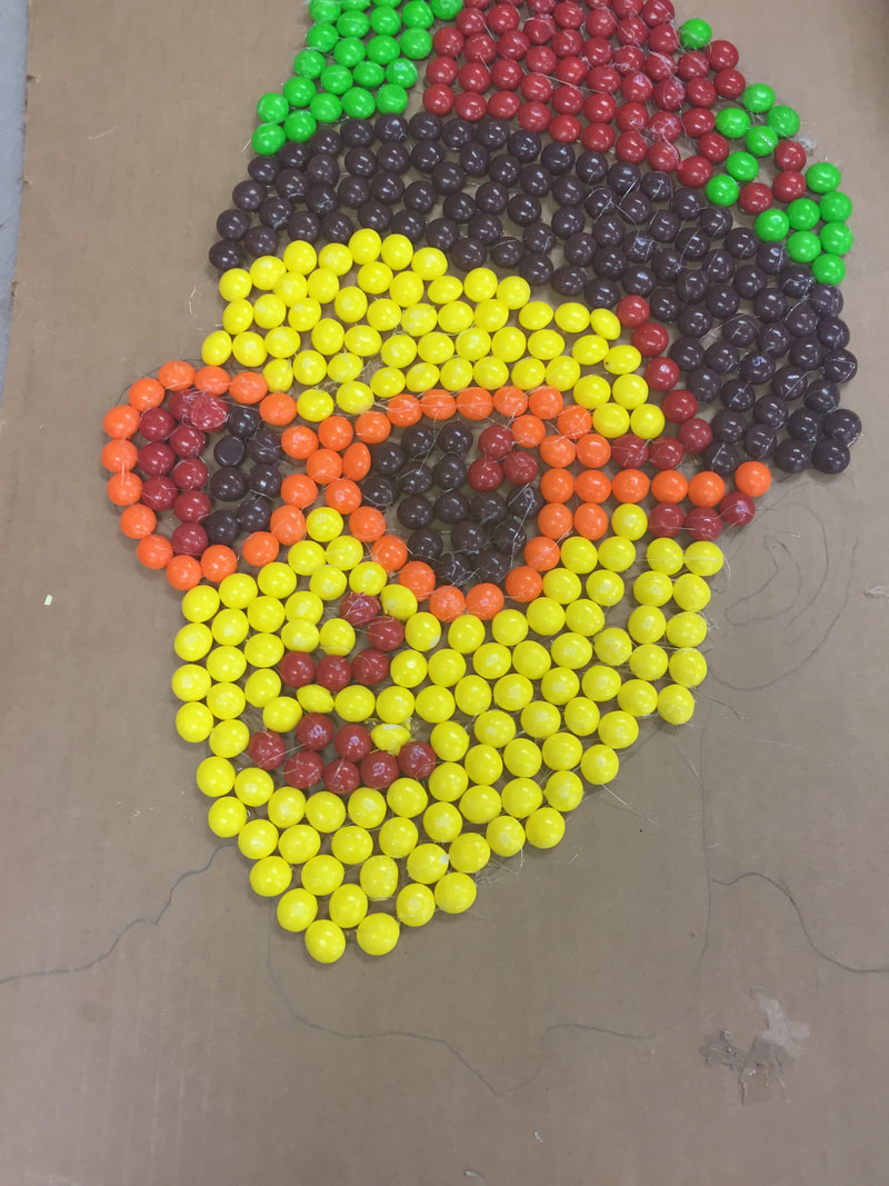 The image above is how much work was done after day 1 of working on the project. I had finished the majority of the head and face. After the second day, I had finished the piece, which resulted in the beginning pictures. I intentionally chose to leave the background blank because in my eyes the color of the portrait looks better against a blank backdrop. I found that drawing out the image before putting the Skittles down worked well, because then I could see what I was drawing. If I had to redo the project I would choose to glue the Skittles in a different way so that there wouldn't be as much of the stringy glue left behind.
        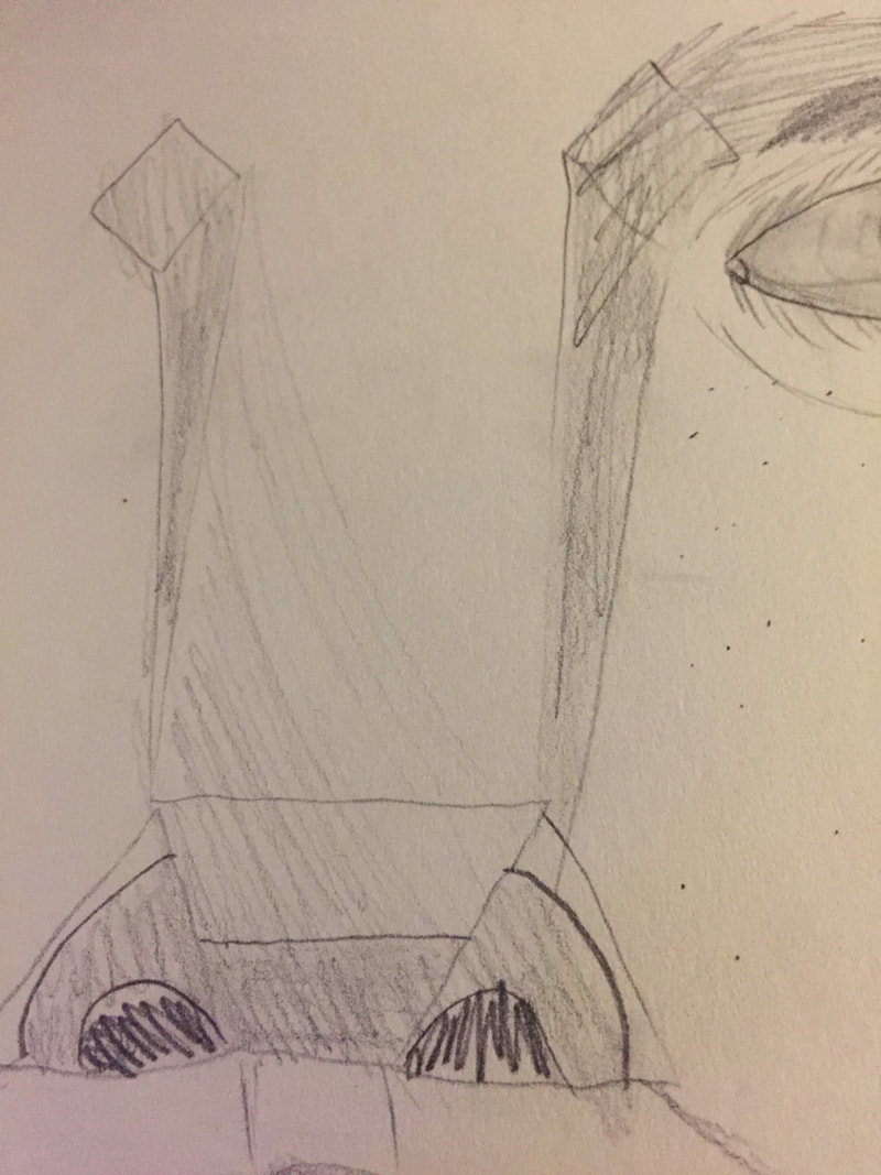 So far, the nose warm up is the most useful in my portrait. Although I only had to sketch out my piece to be able to glue the candies to it, I needed to know how to make the nose look realistic. When drawing people the noise was never a strong point of mine, but now I posses the skills necessary to make one. The most surprising thing I found out about facial proportions is that your head is the length of one of your eyes times 5.
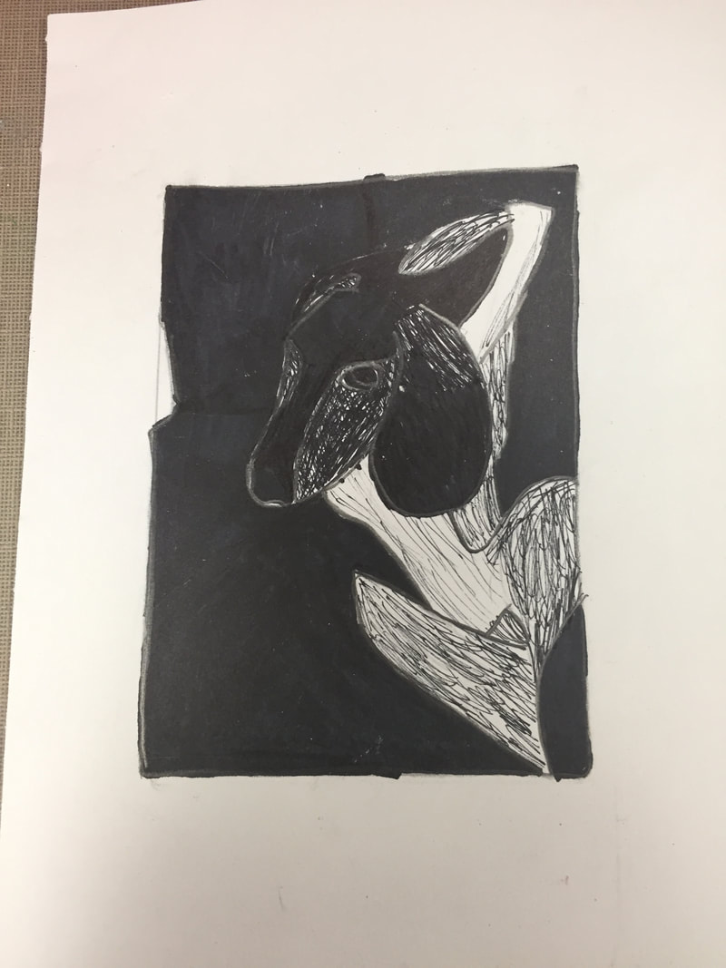 I started this project by sketching a drawing of my dog, then filling in some of the extra area, which would be removed once I began cutting. 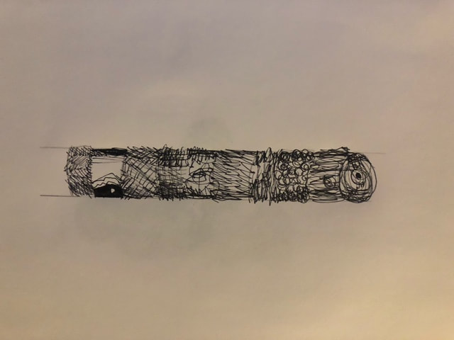 After I finished the drawing, I removed the excess parts from the block. I added line details to make the design more realistic, and tested it buy printing a few images. 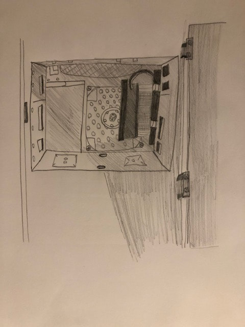 The finished image is shown above. I feel like my piece was successful in conveying certain areas of depth or designs, such as the line work featured along the tail and hind legs. I also feel that for cutting for the first time in this material that I did a quality job and the end result was satisfying. if I were to do this piece again, I would add a design to the background, the only reason I did not do that this time was that the picture I was basing off of had a solid background, which I went along with. My print shows off the theme of line through the details on the tail, hind legs, and lower ears and paws. I feel that these lines signify the prints of the fur on my dog, and in my eyes give a more realistic feeling to the piece.
   I began this project with a plan to make a simple square box with the interlocking lid function. So far, the most diffucult part is that I am not as skillful with clay as I am with a pencil, so it took a while before things began to take form. I also wanted to keep it simple since I am not very advanced. I made the 5 slabs of greenware for the walls and bottom, then slipped them together. I added then a lid with an interlocking ability. I then scratched on a design I found pleasing, and set the piece to be bisque fired. So far, I found that cutting the slabs equally was the most successful, as it was simply a matter of measuring and cutting the slabs.
After the first firing, I painted coats of glaze to make the box stand out, then applied a coat of glazeware to finish the coats. 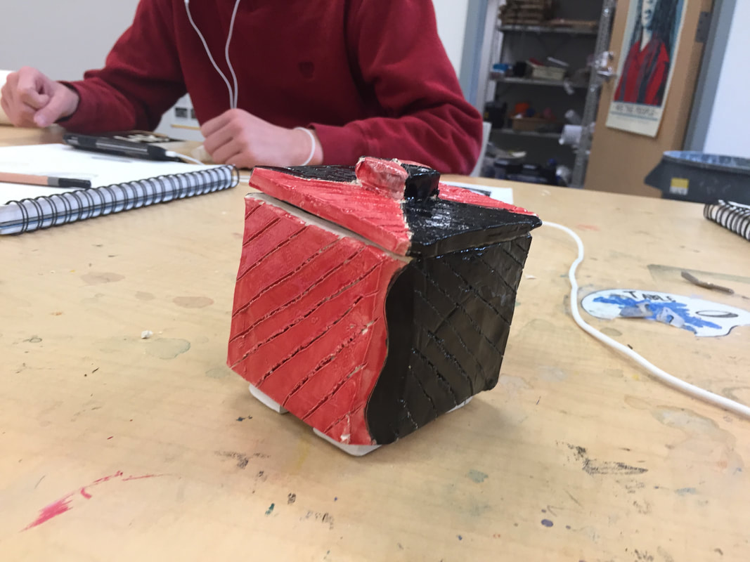 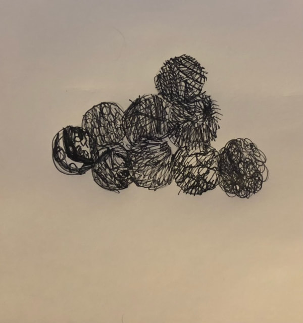 For the finished piece, I found that applying glaze was most successful, because of skills learned when painting. If I had to do this project again, I would change how I made the lid interlock, because on this piece it fits a bit loosely.
|
AuthorI am currently a Computer Arts student at AHS. Archives
January 2019
Categories |
 RSS Feed
