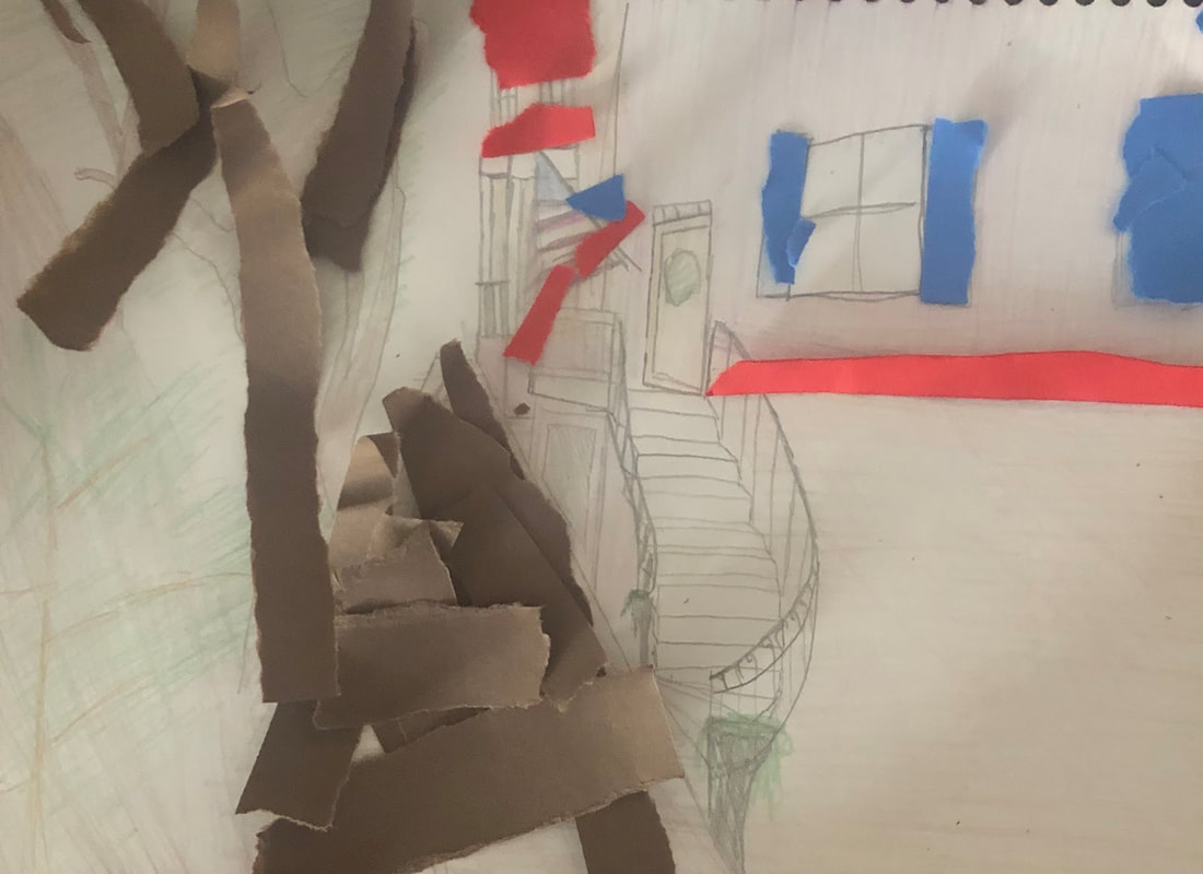
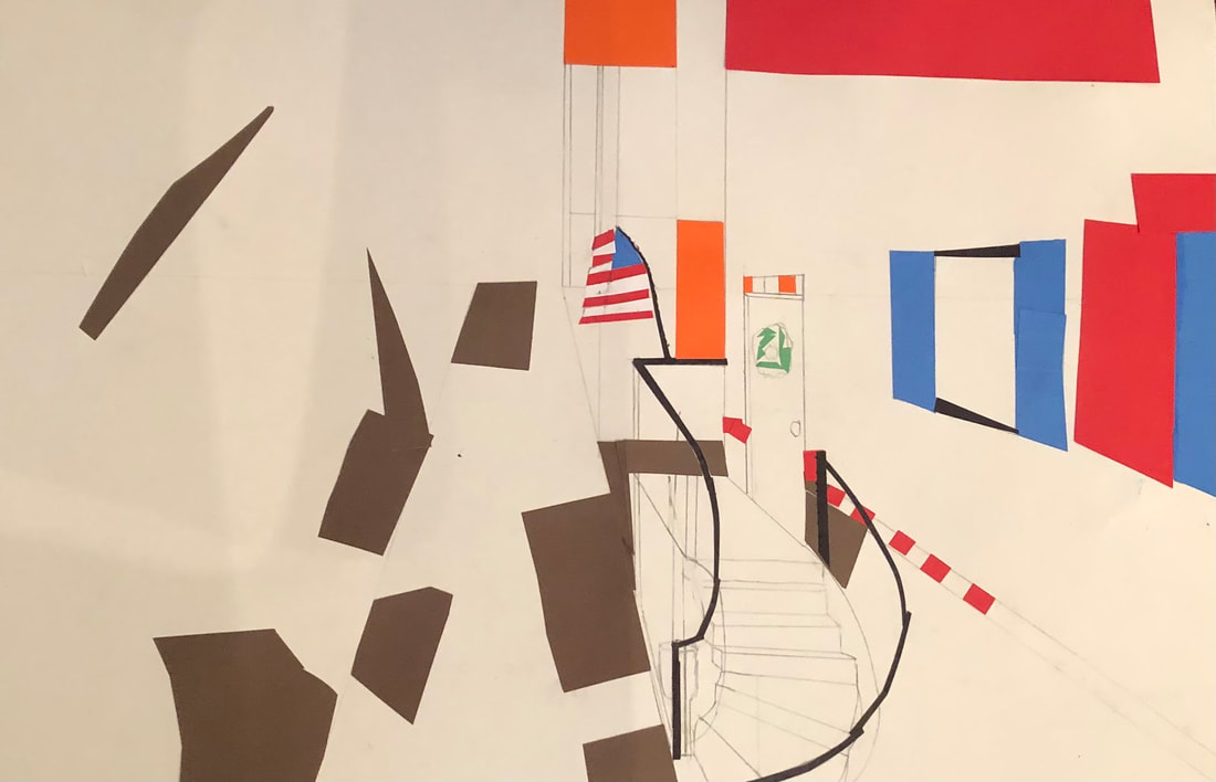
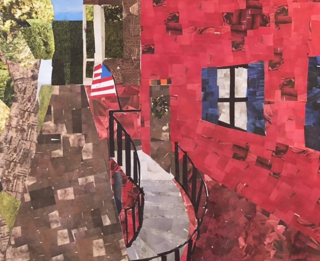
Collage - Historical Area
Brainstorming Ideas:
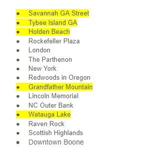
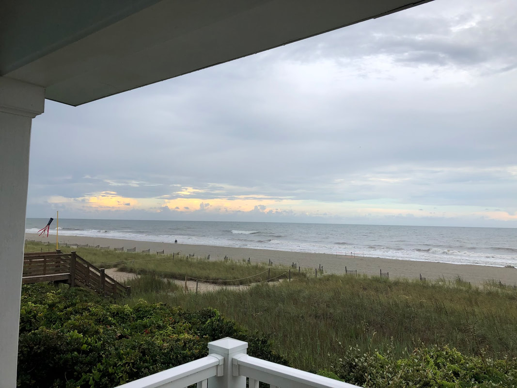
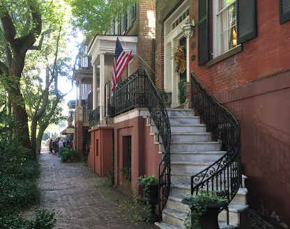
Compositional Sketches/Reference Photos: Since I had photos, I was told to only do one color sketch.
|
|
|
In-Progress Photos:
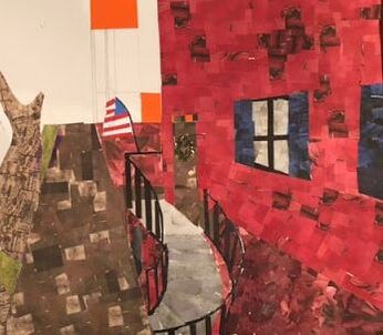
Final Collage:
Self-Reflection Questions:
- Describe why you chose your subject matter and what makes the composition interesting?
I chose this subject because Savannah GA is one of my favorite places to visit. I really like the historical background of the city, and the scenery is very pleasant to look at. I especially like the brick buildings, so that's why my piece is centered around one. - Describe the accuracy of your proportion, values and shading.
I found that small clippings of magazine are not my favorite medium. I had a difficult time finding the correct values, but in the end I think it turned out alright. My proportions are a little off on the red building, but I think I did well on the path and the smaller building. As far as shading goes, I tried to be as accurate to where shadows would fall by using darker colored pieces. - How did you use texture to add visual interest?
I am especially proud of the tree trunk, as I found a way to use clippings of wooden textures to make it look as if the tree has textured bark. - How did you decide what shapes and textures to use for your collage?
I just tried to stick to the shapes of the objects in the reference photo. I used more square pieces for bricks on the house, and more organic and curvy shapes for the trees. Again, I found clippings that made it look like the tree had textured bark, and leave/greenery clippings to make grass and leaves. - Do you feel that you used a full range of values to reproduce your photo in the collage format? How have you attempted to create depth using foreground, middle ground and background?
I used multiple shades of colors to try to capture different values and shadows. I feel that using the path on a 1-point vanishing point leads to a good perspective. I kept this in mind whilst making the red building and the brown building so that they would be proportionally correct. The windows and doors in the foreground on the red building are scaled and arranged to the vanishing point. - Describe your craftsmanship. Is the artwork executed and neatly crafted?
I struggled more on this project than any other project I've done in this class. I spent a lot of time looking for the right colors in magazines, and then had to cut small pieces out. Overall, I feel that I did it to the best of my abilities with this medium, as it was really my first time doing a serious collage. I made sure that all of the page is filled so that no white spaces are left behind. I could have been neater on the leaves, but I was pressed for time and had few magazine pages left. - Describe how you might improve your artwork if you were to redo the project?
I would add more detail to the red house, such as individual bricks. I would also make the background near the single vanishing point make a bit more interesting, as I only had a little bit of the sky and a large bush. I would also redo the leaves on the tree, but I could not find a better way with my current materials.
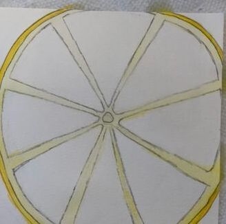
O'Keefe Inspired Painting
Brainstorming Ideas:
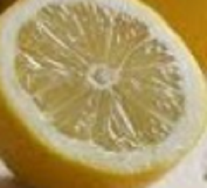
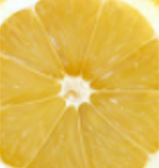
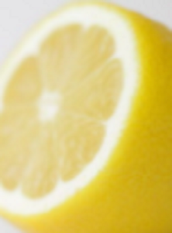
Compositional Sketches/Photos: Since I had photos, I was told I didn't need to make compositional sketches.

|


|
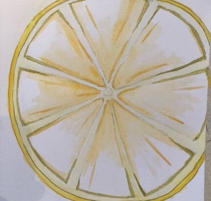
In-Progress Photos:
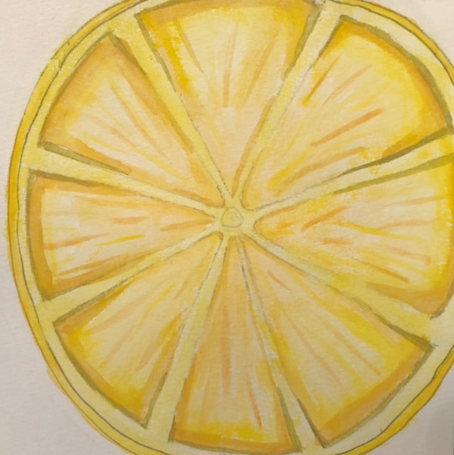
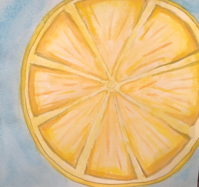
Final Painting:
Self-Reflection Questions:
1. What watercolor/colored pencil techniques proved to be effective in your painting/drawing? How and why?
I think that making small lines using different shades of yellow and orange was very effective, as it made the inside of the lemon look as if it had the natural fibers. I also made sure to wet the area before applying color to the paper, and it made the colors blend better.
2. How important was using transparent layers (just layers for colored pencil) in your painting/drawing?
I really didn't use too many transparent layers for colored pencil, as I simply added the pencil after the paint had dried. I think that the effect helped to make the colors more vibrant.
3. Explain how your composition was successful? Did you utilize all the elements of art and principles of design? Explain.
I used techniques for watercolor and colored pencil multiple times while making this work. I feel that the lessons I learned about blending paint colors really helped me mix the hues of yellow and orange to my advantage. I also used a drybrush technique for the light blue background, which really helped the colors of the lemon stand out.
4. Was color choice an important factor in the overall success of the painting/drawing? Why?
Color choice was very important for me, as a lemon is multiple different shades of yellow. When I had exhausted the different yellows in my paint set, I had to begin mixing and blending orange and yellow to get the colors I needed, especially for the inside "slices" of the lemon.
5. How did you use your knowledge of Georgia O’Keeffe as inspiration for this piece?
I used my knowledge of how Georgia O'Keefe utilized bright colors against a single-color background as the basis for this piece. Going into this project, I wanted to have a simpler background so that the object would really stand out, similar to how Georgia O'Keefe created her Cow Skull pieces with minimalistic backgrounds.
6. Describe your craftsmanship.
Going into this unit, I was not confident in my ability with watercolor. By practicing techniques taught in class, I was able to gain control over the brush and utilize different methods of applying paint. My biggest improvement was wetting the paper before I applied paint, which helped the colors to be more vibrant.
7. If you were an art critic how would you judge your work?
I would say that it is good for a beginner in watercolor, which is how I see myself. I think that I did well with the interior of the lemon and the blending, but the outside "skin" of the lemon looks a little rough. I should not have used dark pencil lines to sketch that part of the piece.
8. If you were able to do something different what would it be and why?
As stated above, I would have sketched the piece lighter, so that I could erase the pencil marks once I began painting.
9. Explain to me what you have learned about watercolor/colored pencil and how it has improved or discouraged your development in art.
I went into this unit barely knowing anything about watercolors. I had worked with colored pencil multiple times, so I felt confident in that medium, but I was not good with brush control or color blending. Learning about the brush techniques and how to layer colors really helped me through this unit. I also learned tips like wetting the paper before painting and also being conservative with the amount of paint on the brush. This unit has really encouraged me to continue painting with watercolors outside of class.
Watercolor Pepper
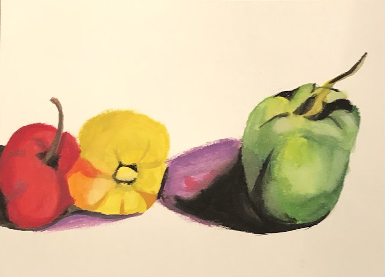
For this piece, I feel that the best one is the green pepper, as the details on the yellow and red peppers have not come through in the way I had hoped. I also could have spaced this one better, as the green pepper is too far to the left, which causes the yellow and red peppers to be distorted to fit on the page.
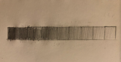
Watercolor Value Chart And Forms
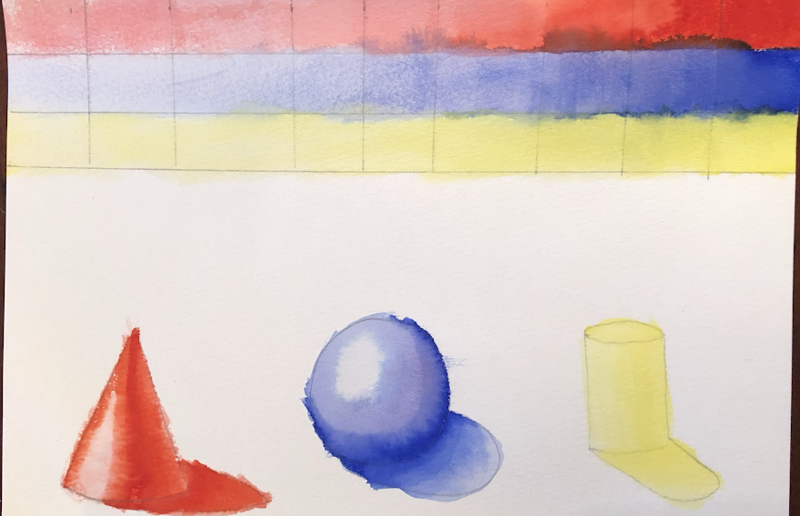
I'm not as good at watercolor as I am at other mediums, so this was a good exercise for me to learn some skills. I think that the blue and red went well on the forms, but it is hard to tell the values on the yellow.
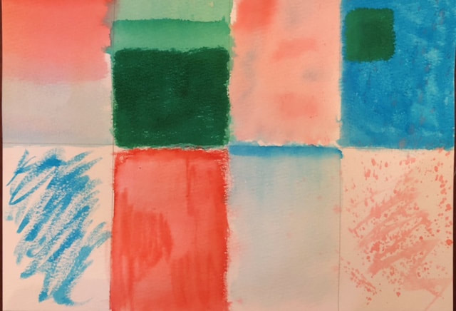
Watercolor Techniques

Here are all of my watercolor techniques. My favorite one is the gradient one, 3rd on bottom row.
Colored Pencil Fruit/Veggie
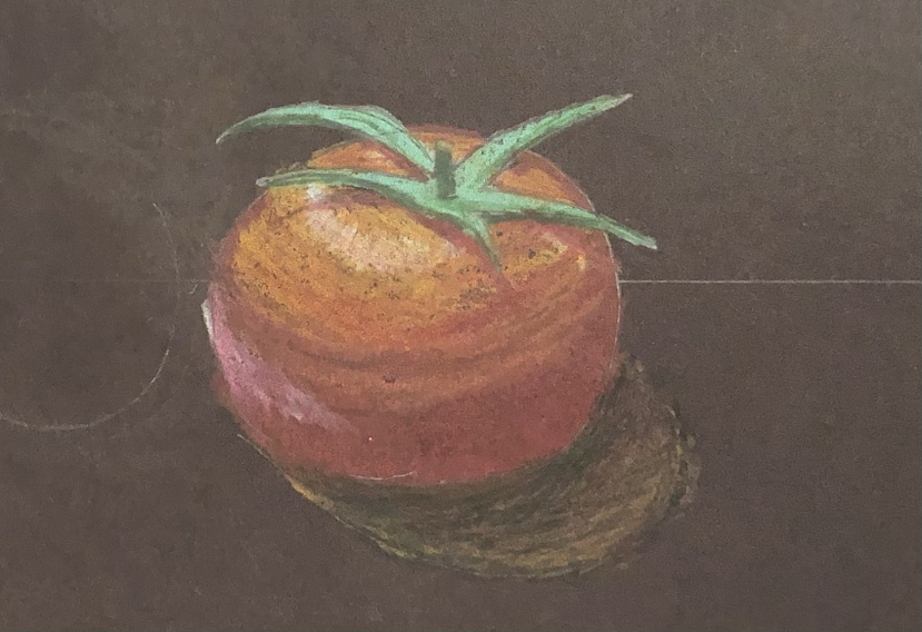
For this assignment, I chose to draw a tomato. I feel like I could have done better on the shadow, but I like how I blended the red, orange, and white towards the top.
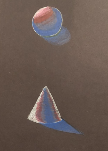
Colored Pencil Forms
|
|
|
I feel that I did well for these colored pencil forms. My favorite is the one done on the black paper, as you can really tell the contrast between the background and the shapes.
Colored Pencil And Watercolor Unit
Pen Perspective Project
Brainstorming:
Compositional Sketches:
|
|
|
|
|
|
Final Sketch:
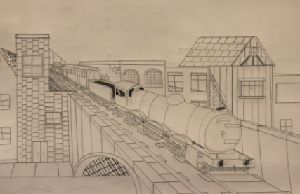
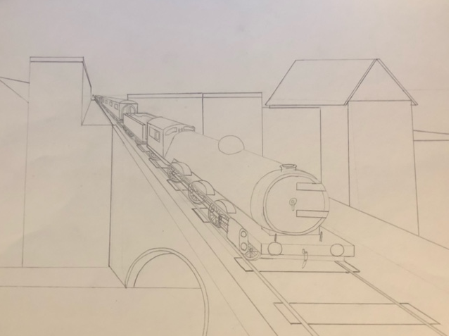
WIP Photos:
|
|
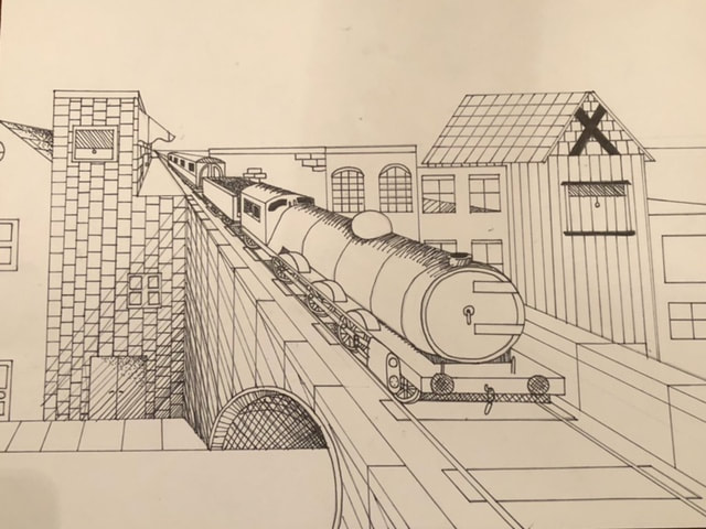
Final Drawing:
Self Evaluation:
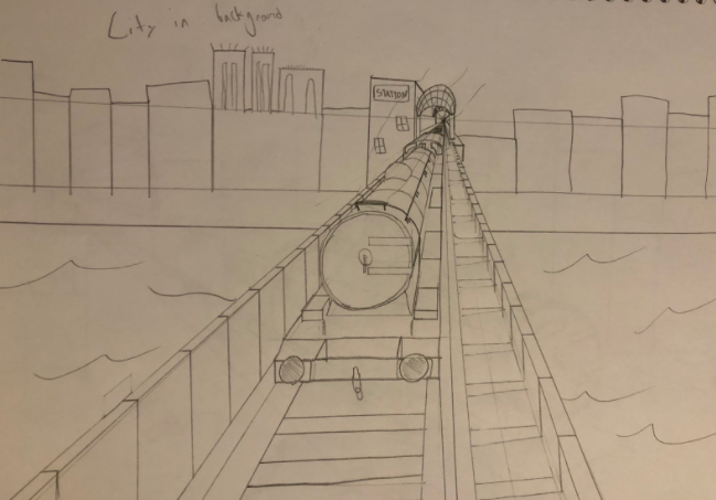
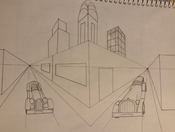
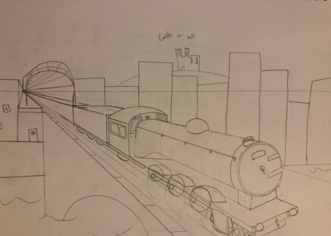
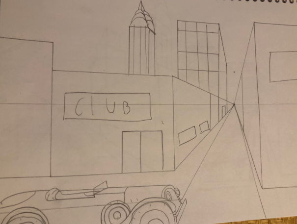
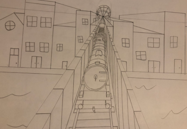
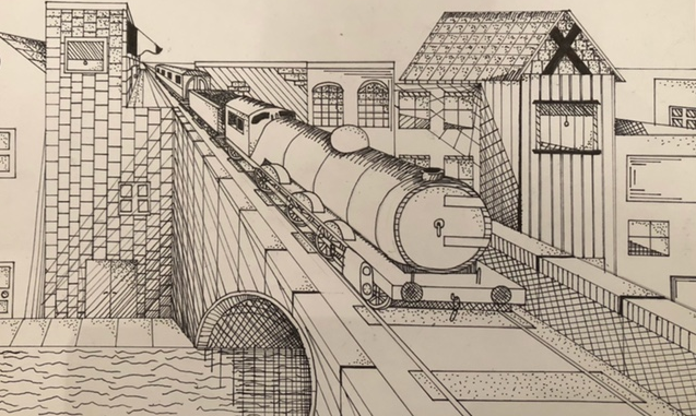
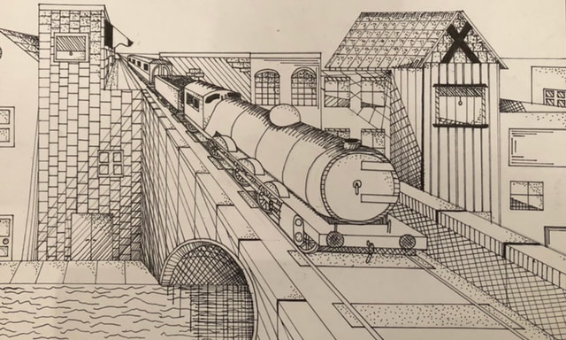
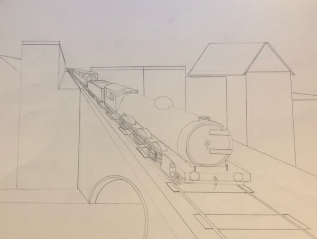
- Discuss your decision on pen and ink techniques. Why you chose to use one or more. (If you used stippling in certain areas explain why you chose this technique. Explain for all other techniques used). I chose to use a lot of stippling in my final drawing because I found it was easier to control for smaller areas on the drawing. I also found that it worked well for the windows on many of the buildings. I also used a lot of cross-hatching and straight lines. I found that for doing the shadow of the buildings, the diagonal lines were best for making it look realistic. When I did the train itself, I had to think about how to add value to the rounded boiler. I decided to make slightly rounded lines following the slope, and I feel that it worked well.
- How did you use perspective? Why is perspective important? The focus of the piece is the train coming from a point on the horizon and expanding in view as it gets closer to the viewer's point. The perspective is important, as it draws attention to the train coming across the bridge and cements it as the main point of the drawing.
- How is texture important in your composition? I used texture on the water running under the bridge to make it look as if it was quickly rushing by. I also tried to incorporate some texture into the roof of one of my buildings towards the right of the picture to make the shingles look a bit more realistic.
- Why is value so important in this project? Value is important because it shows how light falls on the scene, and adds realism. I used value to really show how under the bridge it is darker, and how the light falls upon the train itself.
- Describe your craftsmanship (How well the project is crafted technically) I think that I did a overall good job on my drawing. I made sure to keep my lines controlled and focused on getting my values to look good. I had to think about how the light fell on the scene and where you would see shadows, such as under the bridge or beside the taller buildings.
- If you could recreate your piece what would you do differently to enhance your final outcome? I would make some of my values darker in certain areas. Towards the right of the picture, I feel that some of my value fall short and are more of a flat color rather than a gradient from dark to light.
- (Only answer if you did fairytale) Which Fairytale or Fable did you create? How did you represent the story in your own way? N/A
- When applying the pen and ink techniques why and how is it important to make sure you understand the concepts taught in class? It is important because you only get one chance to get it right with pen and ink. If you mess up with pencil you can go back and erase, which is why the first drafts were in pencil, but once you begin with the pen, you must pay caution to your actions and make sure all your lines are controlled.
- As a growing artist how do you think what you have learned will guide and better your future projects. I learned a lot about the different pen techniques and how and when to use them. I have always preferred drawing with pen as I think it looks cleaner, but I always fell short when it came to adding value. By doing this project, I found that I really liked to use stippling, which is ironic, as at the beginning of this unit I really didn't like how long it took.
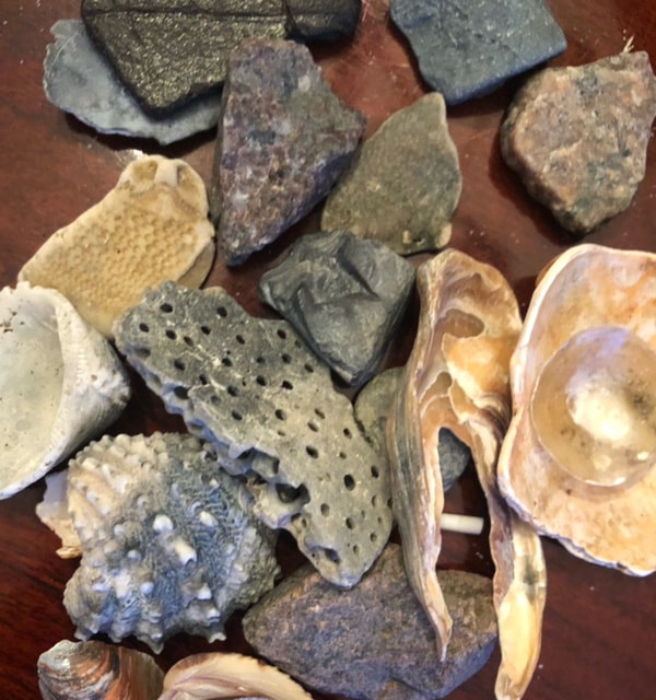
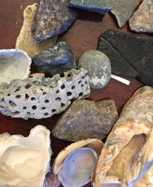
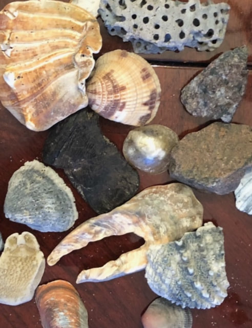
Forced Perspective Photography
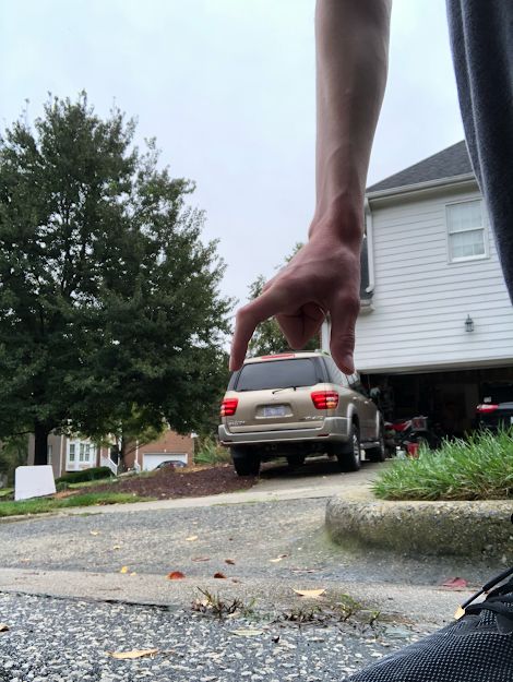
For my forced perspective photo, I chose to do something with my car. I took some different shots with my hand "picking it up", and some with a family member's help where it looked as if they were standing on the hood. I chose this picture as I felt it was the best example of perspective, and the lighting was better than the other photos.
3-Point Perspective
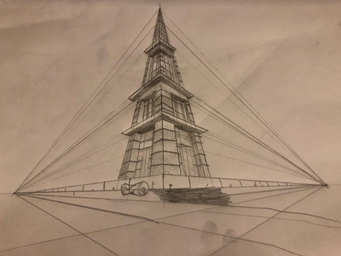
Here is my worm's eye view. I feel like the first few stories went well, but it got a bit messier towards the top because the small details.
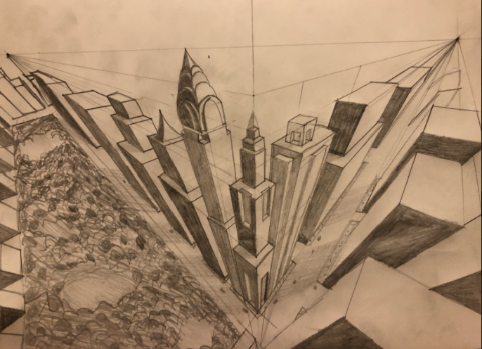
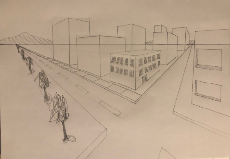
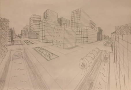
Here is my bird's eye view cityscape. I think that I did well on the buildings, but the park is a bit messy .
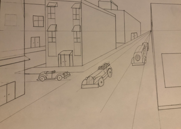
2-Point Perspective
I think I did well overall on the first drawing, but I could have cleaned up the trees a little bit.
For my second drawing, I could have done a better job on some of the smaller details such as windows and such, but I feel that the practice of the first drawing helped to make this one easier.
1-Point Perspective
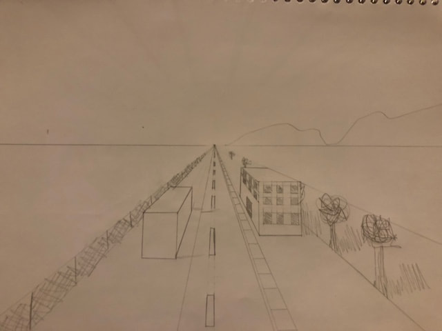
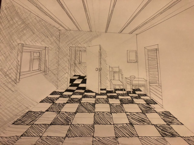
The first image is my application of basic 1-point perspective techniques from the first video, and the second image is my rendition of the more detailed room using 1-point perspective. I feel that I could have been a bit neater on the second drawing, but I think that I did a good job of applying the 1-point perspective to both images.
PEN AND INK UNIT
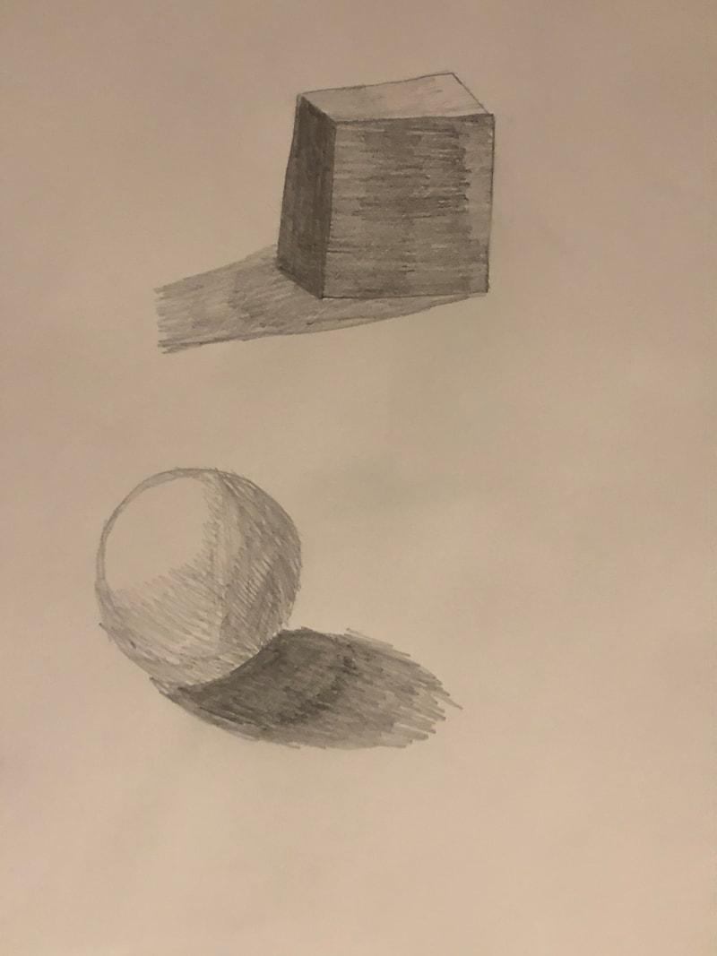
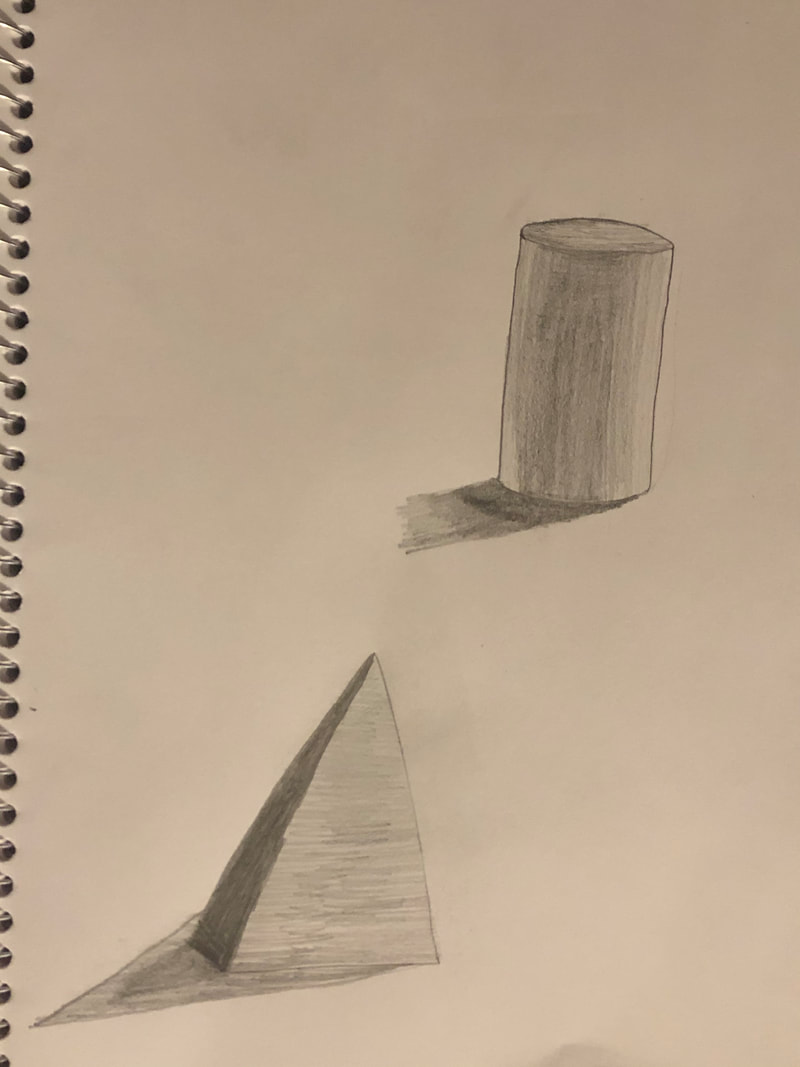
Texture Drawings with Pen
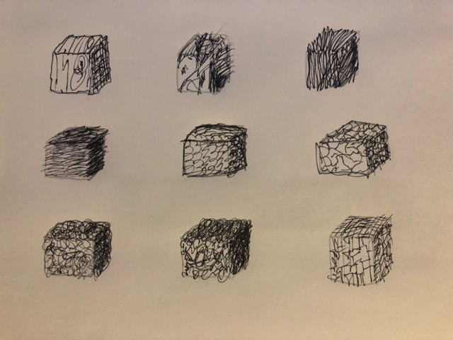
These are my drawings of the video tutorials. I feel I did well on the cubes and spheres, but I could have been neater on the cylinder.
Applying Pen Techniques

For my pen technique drawing, I drew my computer mouse. I think that using stippling worked well for the values on the mouse. If I were to do this project again, I would not shade the inside of the mouse near the scroll wheel with cross-hatching. I would instead use either a unique form or stippling, as the cross-hatch doesn't look as good in my opinion.
Final Unseen Things Drawing
|
Here are the original 3 "brainstorm" sketches.
|
|
In Progress Photos:
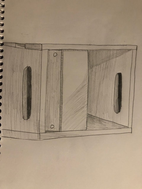
In-progress photo 1:

For this photo, I had just finished the rough sketch of the piece with very little shading or shadowing. My main focus here was to get the proportions correct.
In-progress photo 2:
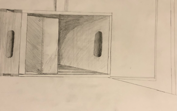
For my second in-progress photo, I had begun to use value on the crate and notebook inside. I still had to do shading on the cabinet and the desk.
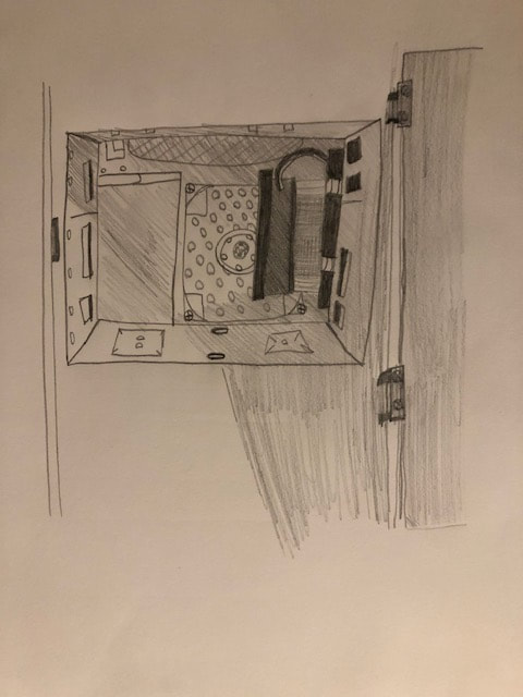
Final Unseen Things Drawing:
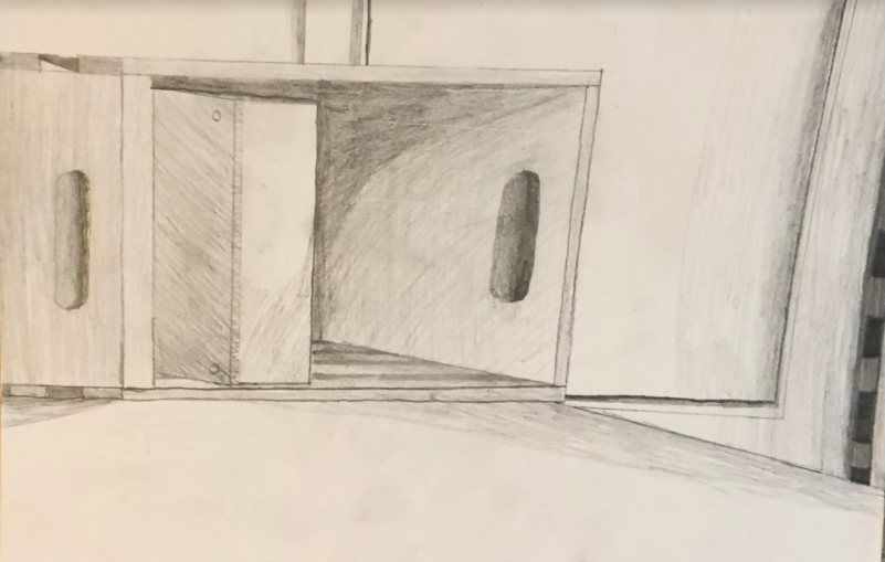
Here is my final unseen things drawing, complete with shadows, value shading, and lines done. It is of a storage crate next to my computer on my desk, and part of the cabinet next to my desk.
Critique:
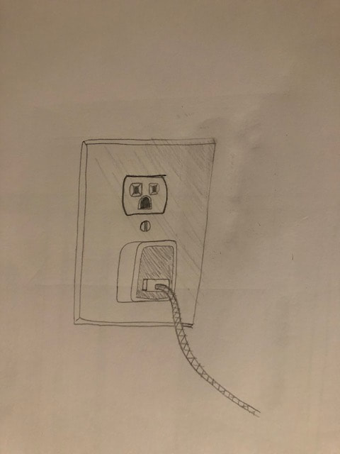
1. I started with my 3 rough sketches for brainstorming. I decided I would go with the storage crate, as the outlet and plug were too simple and the inside of my computer was difficult for me to draw with all the small details. I made another rough sketch to make sure all of my proportions were correct, then began to shade the crate and apply small details. After I finished with the crate, I used value on the cabinet and desk around the crate. Finally, I made sure everything looked natural and turned it in.
2. Composition is very important to the success of the drawing. The way that the objects within the drawing are placed helps to guide the viewer's eye, and helps to achieve balance in a drawing. I had to make sure the crate was in the right position, and not dead center in my drawing, otherwise it would not have appealed to the viewer.
3. I found the different values in my object by studying the shadows and how the light fell on the crate and desk. Then I replicated those shadows by using different degrees of shading on the piece.
4. I think I did achieve a full range of values on my project due to the different variations in shadow on the real-life subject. I carefully noticed how the light fell on the subject and how different shadows were different shades. the shadows inside of the crate were the darkest while the shadows on the cabinet were lighter.
5. I made sure to be very neat when making the final drawing. I used a ruler to make sure my lines were straight and clean, and that there were no stray marks or excessive shading on any part of the drawing.
6. I was not good at value and shading before we began this project. Watching the videos and doing the exercises with the different shapes really helped me improve my skills.
7. As stated above, I was not good at shading and values before this project, and my drawings always suffered from too much or too little shading. Now I know how to use values to create just the right amount of shading.
8. When I began to shade the piece, I noticed that my hand was smudging some of the value, then spreading it to other areas of the piece. From that point forward, I had to be careful where I put my hand and fingers on the drawing, and before I was finished, I made sure to erase any stray marks.
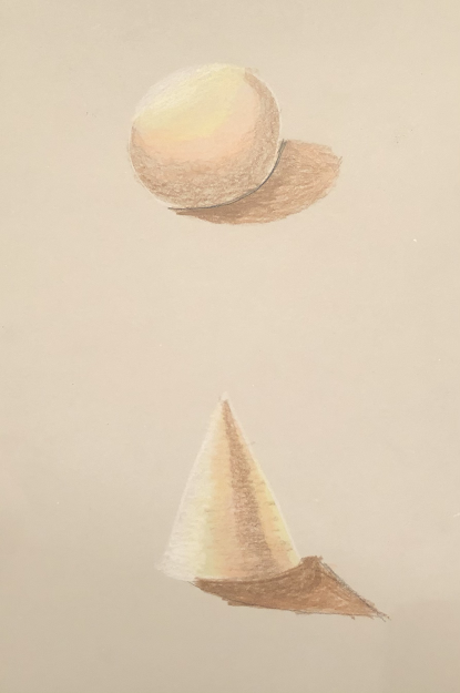
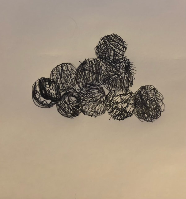
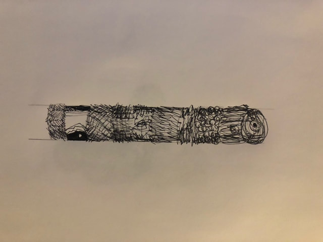
Shaded Forms
Here are all of my shaded form drawings. I think my best one is the cylinder.
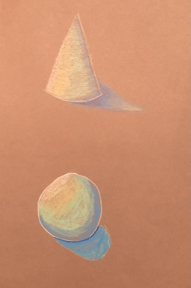
Value Chart
I feel like I did well shading on the lighter side of the spectrum, but I could use more practice on the darker side.
Graphite Week 1

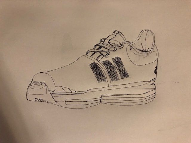
For my pencil drawing I drew a houseplant in my kitchen, while for my pen drawing I did 1 of my favorite shoes.
Day 1 Graphite Drawing/Contour

The top two pictures were drawn in pencil while the bottom two were done in pen.
Final Photos and Write-Up
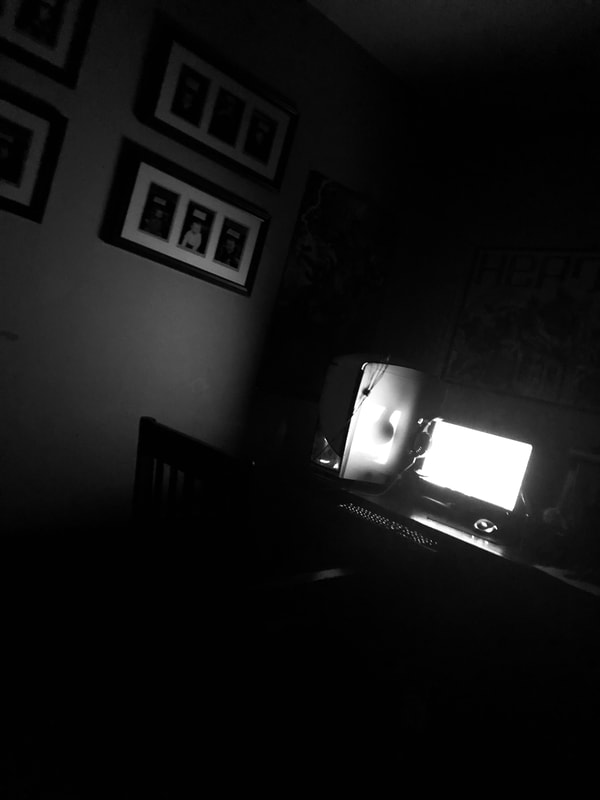
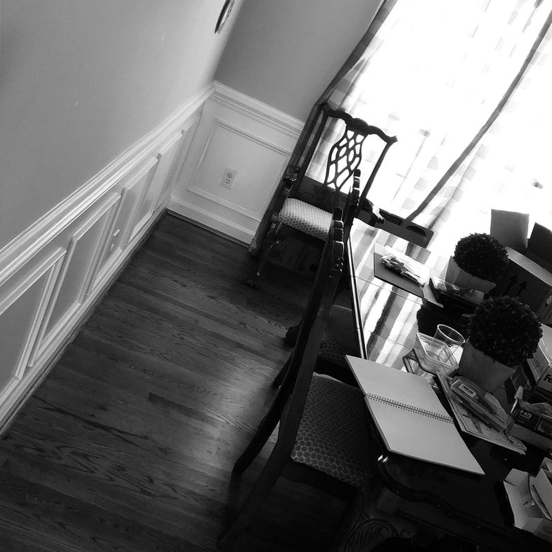
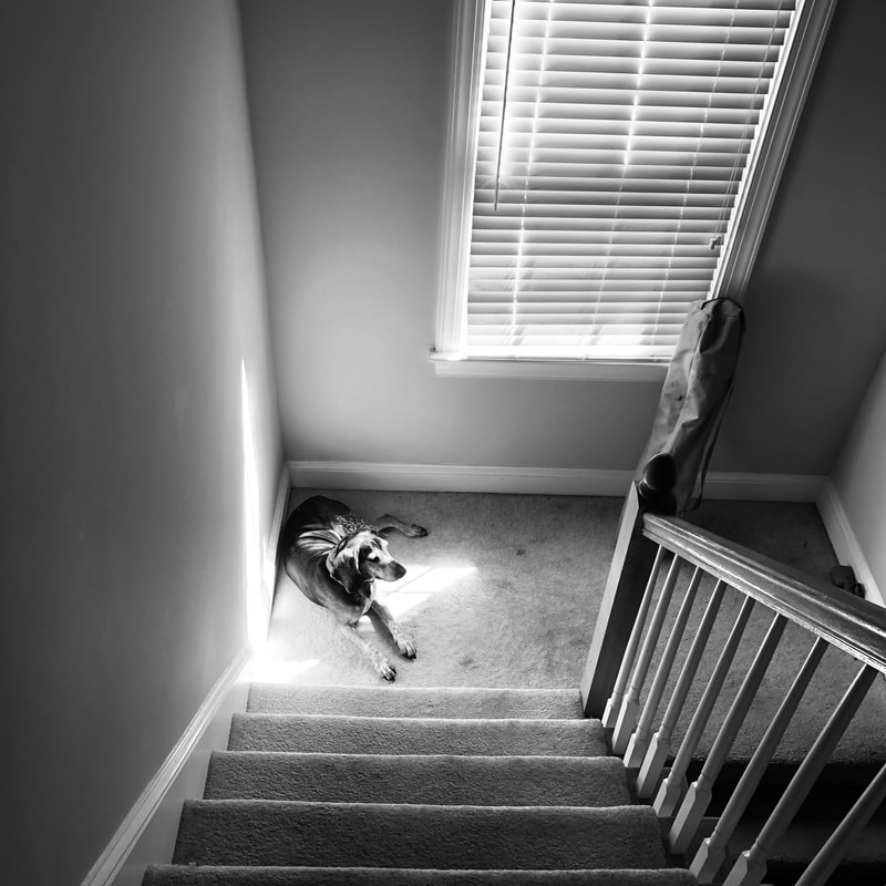
For my piece I decided to use black and white filters and use light to my advantage. The first photo is a picture of my computer in a dark room, with bright light coming from the monitor. My second photo is of an open sketchbook with light coming in through the windows behind it. My third photo is of my dog laying in a sunbeam at the bottom of a flight of stairs. I chose to really focus on space within my photos. The main subject of the photo takes up little space in each one, with the main focus being how the surroundings frame the main object. A common theme in the photos is that the left side of the shot is mostly blank, usually a wall. This makes the viewer focus upon the main subject. I also used emphasis within my pictures. All of the main objects in the photos are the opposite color of the rest of the photo. The bright light coming from the monitor emphasizes it instead of the darkness around it, the white pages of the sketchbook emphasize it instead of the drab walls, and the dark color of my dog emphasizes him instead of the mostly gray area around him.
I wanted to show what going back to school during quarantine felt like to me. The computer represents how I have found myself staring at the monitor for hours per day, especially with online classes. The sketchbook is blank to show that I have been having trouble coming up with new ideas to draw and sketch, which I usually have no problem with. My dog is usually very hyperactive and loves to play, but with everyone shut up in their rooms on their computers, he become bored and lonely.
I found that using the black and white filter on my project made the photos look a lot better. I also learned how to incorporate light into the photos to help frame the main subject. This project also helped me better understand the use of composition within photos and how to use the golden spiral to make things look better.
Photo Composition 9/1/20
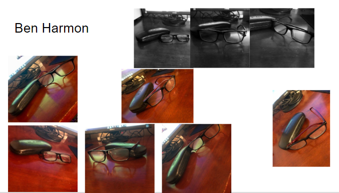
I decided to photograph 9 picture of my reading glasses at different angles. My best shots are the 3rd black and white and the middle shot at an angle.
4 Assessment Drawings 8/28/20
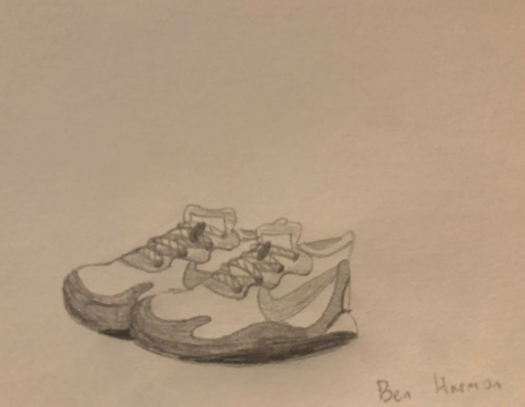

The top drawing is of a pair of my shoes. The second drawing is from a picture of my friend Web. The third drawing is my downtown portrait, and the final drawing is of my left hand.
