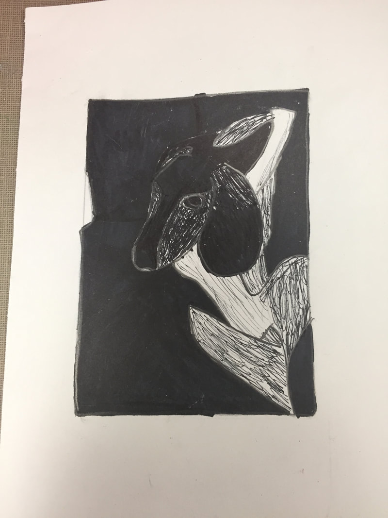
 I started this project by sketching a drawing of my dog, then filling in some of the extra area, which would be removed once I began cutting.  After I finished the drawing, I removed the excess parts from the block. I added line details to make the design more realistic, and tested it buy printing a few images. 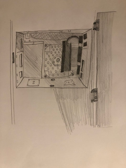 The finished image is shown above. I feel like my piece was successful in conveying certain areas of depth or designs, such as the line work featured along the tail and hind legs. I also feel that for cutting for the first time in this material that I did a quality job and the end result was satisfying. if I were to do this piece again, I would add a design to the background, the only reason I did not do that this time was that the picture I was basing off of had a solid background, which I went along with. My print shows off the theme of line through the details on the tail, hind legs, and lower ears and paws. I feel that these lines signify the prints of the fur on my dog, and in my eyes give a more realistic feeling to the piece.
0 Comments
   I began this project with a plan to make a simple square box with the interlocking lid function. So far, the most diffucult part is that I am not as skillful with clay as I am with a pencil, so it took a while before things began to take form. I also wanted to keep it simple since I am not very advanced. I made the 5 slabs of greenware for the walls and bottom, then slipped them together. I added then a lid with an interlocking ability. I then scratched on a design I found pleasing, and set the piece to be bisque fired. So far, I found that cutting the slabs equally was the most successful, as it was simply a matter of measuring and cutting the slabs.
After the first firing, I painted coats of glaze to make the box stand out, then applied a coat of glazeware to finish the coats. 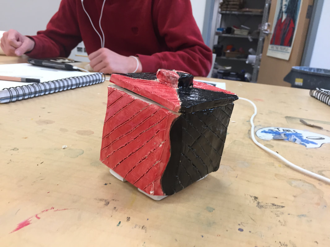  For the finished piece, I found that applying glaze was most successful, because of skills learned when painting. If I had to do this project again, I would change how I made the lid interlock, because on this piece it fits a bit loosely.
For this exercise, we started off with a warm-up involving brown paint. To make the base brown,we had to mix colors like yellow and red, then a darker color like a bit of black. We then had to use other colors along with the brown to make a series of brown shades. We used colors like white and black to darken or lighten the brown depending on the shade needed.  Next, we tested different colors to find different shades and how they looked. I learned that using darker colors and mixing them with the base tone gives a darker shade to the base color. Also, adding a lighter color to the base color gives a lighter shade of the color.  Finally, we took a single photo and applied a transparent sheet over it. We then painted over the original picture to get a copy, using our newfound skills with shades and tones of different colors.    |
AuthorI am currently a Computer Arts student at AHS. Archives
January 2019
Categories |
 RSS Feed
